Concept Packaging Graphics
A little background
I haven't had the opportunity to work on many packaging-related assignments throughout my career. To help round out my skills, in my spare time, I utilize Gemini AI tools — prompting it to generate briefs for packaging graphics projects. I do some quick research and concepting. Then I get to work.
I haven't had the opportunity to work on many packaging-related assignments throughout my career. To help round out my skills, in my spare time, I utilize Gemini AI tools — prompting it to generate briefs for packaging graphics projects. I do some quick research and concepting. Then I get to work.
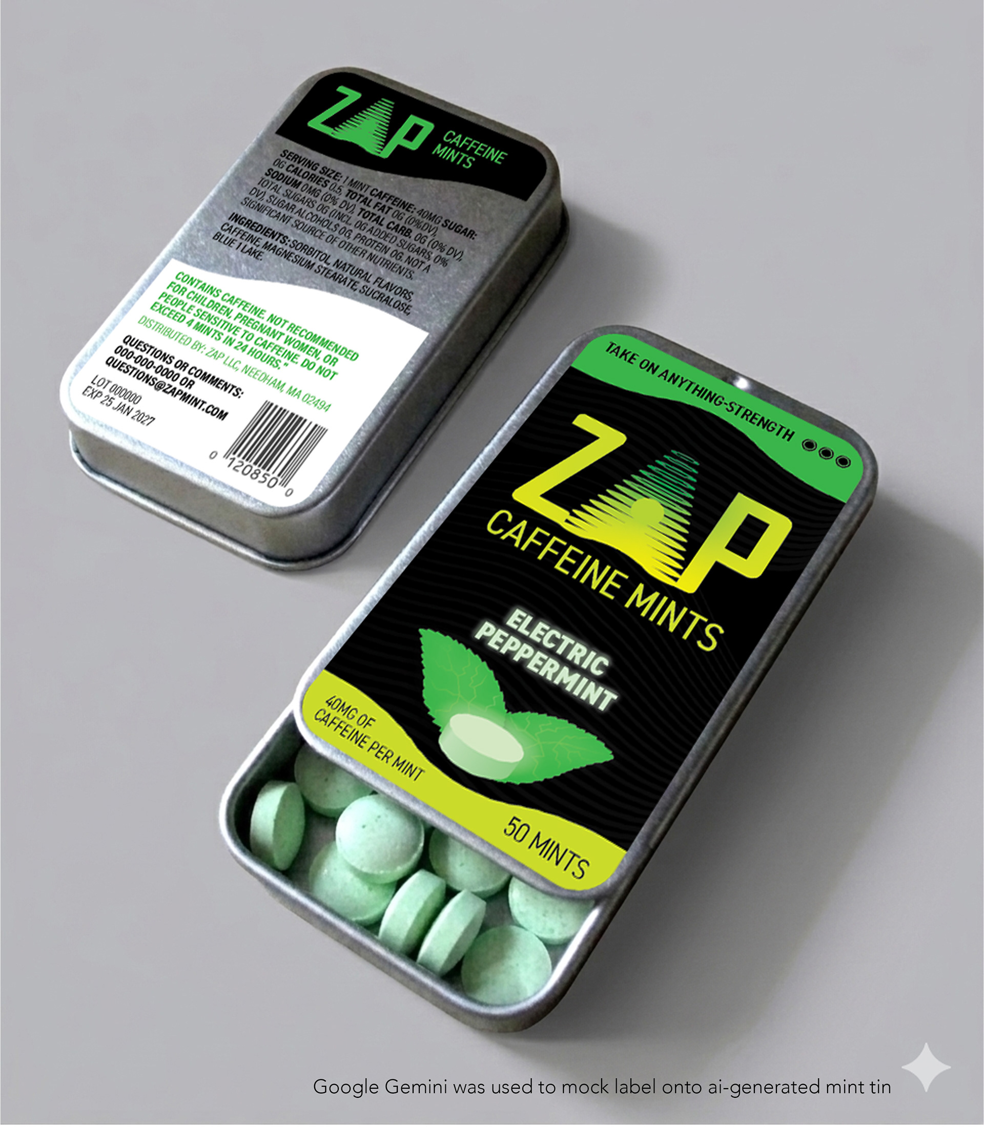
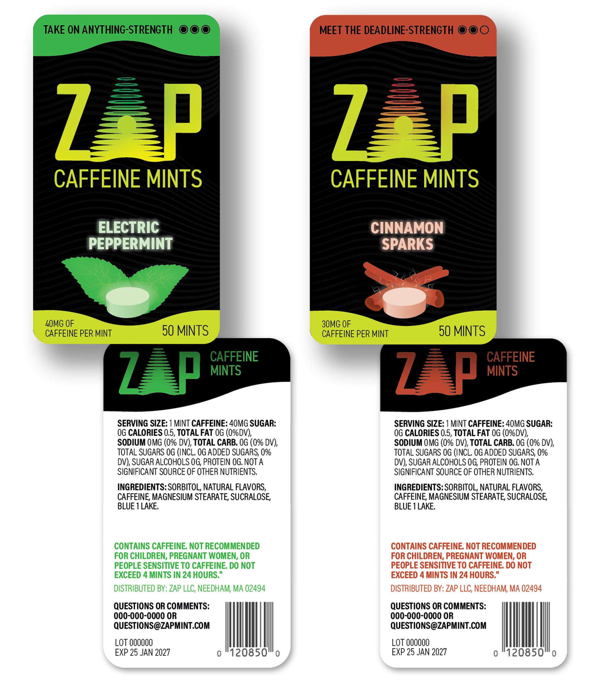
ZAP Caffeine Mints
A brand of caffeinated mints aimed at Gen-Z. Looking for a retro-futuristic tech-y feel, with a bit of a late-90s vibe. I transformed the 'A' into a laser-gun motif to evoke the energy infusion of the mints. With the small-scale of mint packaging, I kept the logo large enough to be scannable in a sea of additional options. The wave effect from the 'A' is used as an additional graphic element to tie the overall look together. Color coding is utilized to quickly distinguish between flavors. I chose a tin with a sliding lid as opposed to a hinged flip-top, as the sliding motion felt more "futuristic" compared to the hinged option.
A brand of caffeinated mints aimed at Gen-Z. Looking for a retro-futuristic tech-y feel, with a bit of a late-90s vibe. I transformed the 'A' into a laser-gun motif to evoke the energy infusion of the mints. With the small-scale of mint packaging, I kept the logo large enough to be scannable in a sea of additional options. The wave effect from the 'A' is used as an additional graphic element to tie the overall look together. Color coding is utilized to quickly distinguish between flavors. I chose a tin with a sliding lid as opposed to a hinged flip-top, as the sliding motion felt more "futuristic" compared to the hinged option.
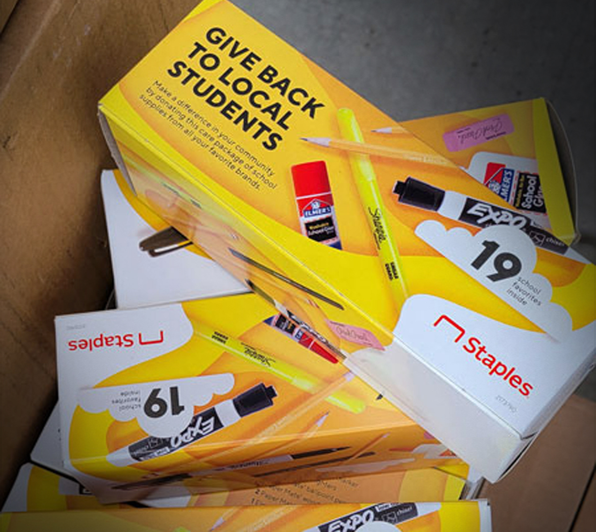
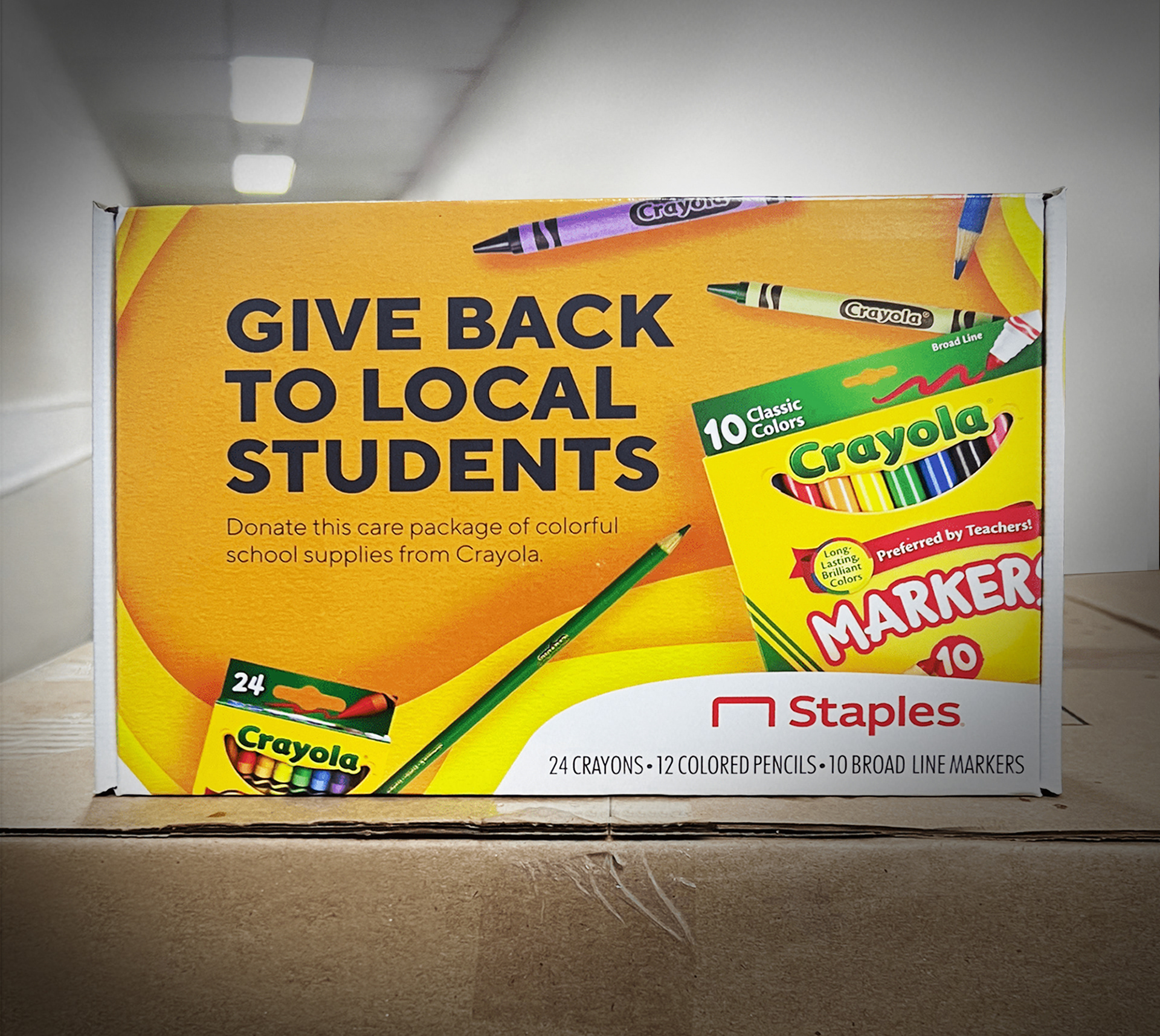
Staples Back to School Donation Boxes
Strategy
For the Back to School season, Staples partnered with well-known vendors to curate supply boxes, which customers purchase to be donated to local schools and organizations in need of school supplies. We were asked to create art for the box that showcased the full assortment of products included.
For the Back to School season, Staples partnered with well-known vendors to curate supply boxes, which customers purchase to be donated to local schools and organizations in need of school supplies. We were asked to create art for the box that showcased the full assortment of products included.
Behind the Scenes
Aligning with the seasonal creative campaign, I designed a package that showcases all the featured vendors. The existing layered, yellow amorphous shape, which was the brand standard at the time, allowed me to highlight all the products in a more dynamic way than a traditional group shot — while also using existing product photography. After the first year's box was well-received, marketing elected to stick with the same creative approach for the following year.
Aligning with the seasonal creative campaign, I designed a package that showcases all the featured vendors. The existing layered, yellow amorphous shape, which was the brand standard at the time, allowed me to highlight all the products in a more dynamic way than a traditional group shot — while also using existing product photography. After the first year's box was well-received, marketing elected to stick with the same creative approach for the following year.
Staples Chair Hangtags
Strategy
In need of a refresh, we were asked to improve upon the existing chair hangtags. It was essential to keep the same form factor, leave space for the price tag and to be able to print in store. Other than that, all elements were up for debate.
In need of a refresh, we were asked to improve upon the existing chair hangtags. It was essential to keep the same form factor, leave space for the price tag and to be able to print in store. Other than that, all elements were up for debate.
Behind the Scenes
With over 40 chair tags needing to be updated, we wanted to make sure we got it right the first time. This was an excellent opportunity to engage with store associates directly. I conducted store visits to see how the current tags were working. Our biggest takeaway was that our previous method of categorization (executive, manager, task) was irrelevant to the customer. With that, we went about shifting the priority of information — emphasizing usage and enhancing the feature callouts. We also shifted to an easier-to-work-with photo style. Keeping the images straight-on and on white allowed for a much easier execution on the production end.
With over 40 chair tags needing to be updated, we wanted to make sure we got it right the first time. This was an excellent opportunity to engage with store associates directly. I conducted store visits to see how the current tags were working. Our biggest takeaway was that our previous method of categorization (executive, manager, task) was irrelevant to the customer. With that, we went about shifting the priority of information — emphasizing usage and enhancing the feature callouts. We also shifted to an easier-to-work-with photo style. Keeping the images straight-on and on white allowed for a much easier execution on the production end.

Staples People Products Flu Fighter Sample Kit
Strategy
Our task was to create artwork for a sample kit of flu-fighting products. This was part of Staples People Products initiative. The goal was to create awareness of a product category that might not be top of mind for Staples shoppers.
Our task was to create artwork for a sample kit of flu-fighting products. This was part of Staples People Products initiative. The goal was to create awareness of a product category that might not be top of mind for Staples shoppers.
Behind the Scenes
People Products had a distinct blocked-out headline treatment. I adapted that into a design motif that wraps around all four sides of the box. I also created a corresponding insert showcasing the samples, including custom product shots to highlight the brands, done in the overhead, People Products style.
People Products had a distinct blocked-out headline treatment. I adapted that into a design motif that wraps around all four sides of the box. I also created a corresponding insert showcasing the samples, including custom product shots to highlight the brands, done in the overhead, People Products style.


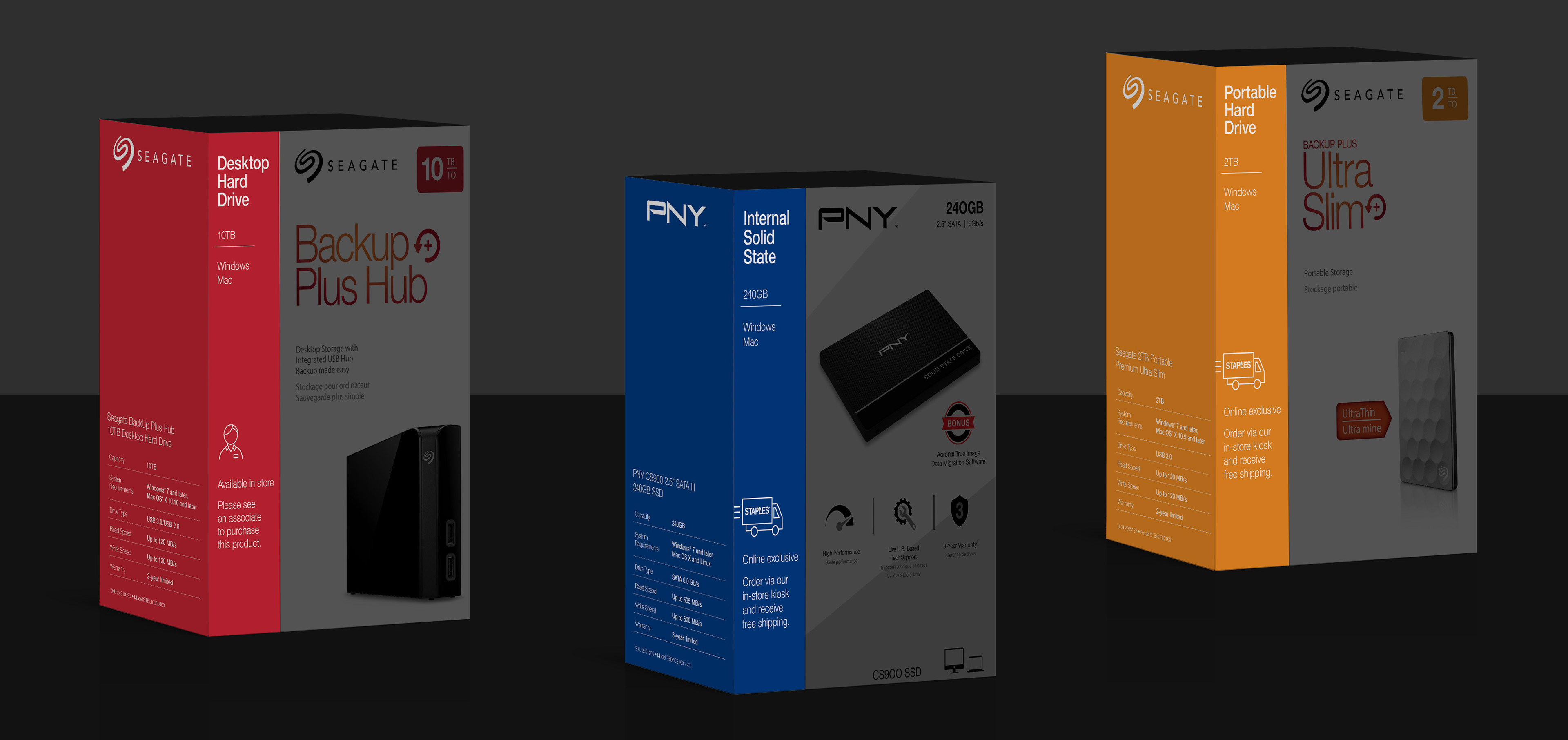
Staples Hard Drive Box Wraps
Strategy
Hard drives, a high-value category, were not available on the sales floor. Instead, on the shelf were corresponding dummy boxes. The goal was to turn the shelf-level box wraps into a selling tool for associates.
Hard drives, a high-value category, were not available on the sales floor. Instead, on the shelf were corresponding dummy boxes. The goal was to turn the shelf-level box wraps into a selling tool for associates.
Behind the Scenes
We took the most important product specs and organized them into an easily scannable panel. This could be utilized by customers or associates. Color coding that matched the store signage further helped with navigation in a POG that could be as long as 24'. In addition, the vendors trusted us to adjust their packaging artwork to fit these unified dimensions.
We took the most important product specs and organized them into an easily scannable panel. This could be utilized by customers or associates. Color coding that matched the store signage further helped with navigation in a POG that could be as long as 24'. In addition, the vendors trusted us to adjust their packaging artwork to fit these unified dimensions.